Felled
Branding “a documentary about giving new life to fallen urban trees”

Goals:
The directors, David Hildreth & Silas Kyler, approached me to brand their documentary film to:
Get accepted into film festivals
Get interviews with Norm Abram and Nick Offerman
Receive placement on streaming services such as Amazon Prime
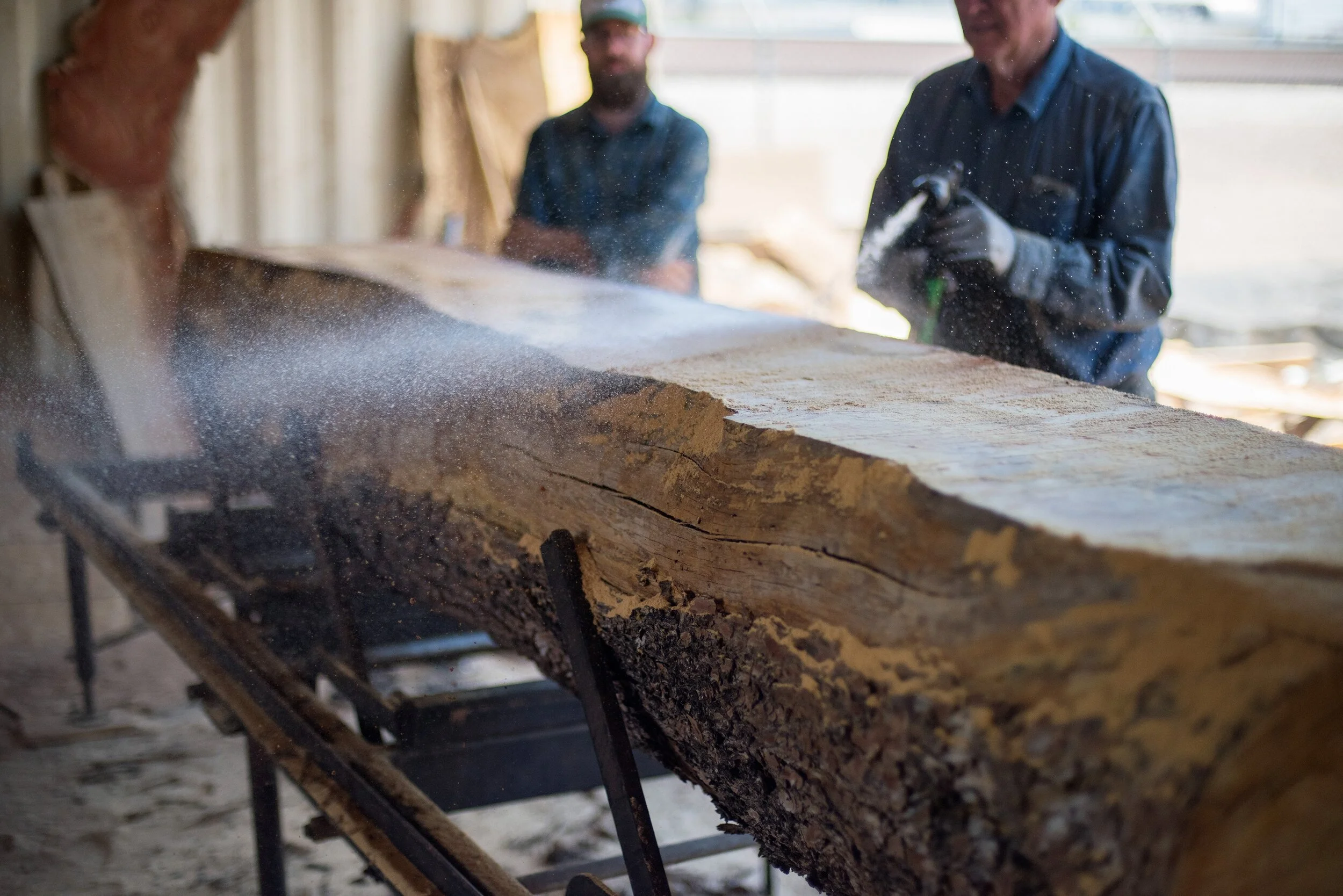
“Felled is a story about finding worth and beauty in what most consider to be trash. The film chronicles the journey of an urban pine tree downed by a summer storm and saved from the landfill by two woodworkers who give the tree new meaning as a family dinner table. Through interviews with industry experts, sawyers, arborists, artists, and woodworkers, including both Norm Abram and Nick Offerman, the film highlights the growing urban lumber movement and explores themes of waste, craftsmanship, and redemption.” – Ranier Film Festival
Logo
I provided two directions—roots and rings.
After a sync on the project, storyline, and goals, I drafted some moodboards and early concepts:
Roots hinted at the emotional resonance within the film.
Rings spoke to the strength and nobility of trees, a creation that commands respect.
We aligned on the ring concept exemplifying the theme of the film, and being a stronger mark for pitching to festivals and for interviews. I refined the illustrated mark and iterated with typefaces.

I whipped up some roughs using my top font picks and presented to the directors.
“These typefaces were chosen to reflect the hand-hewn nature of the table created in the film, but also because they are quirky and unique—a good fit for the target audience and film festivals.”
We discussed the connotations of each font and potential expansions to the system. We landed on a combination that embodied the strength of trees and a theme of the film—trees are worthy of respect.
Solid. Proud. Worthy of respect.
“This concept is all about rings. It speaks to time passing, and the generations that enjoyed a tree long before it was felled. Generations to come can enjoy the same tree if they could recognize the tree’s internal and inherent value. It doesn’t belong in a landfill. Trees have such immense beauty on the inside—just waiting to be exposed.”

Colors
I explored a cool palette and a warm palette of natural tones found in Arizona’s nature (where the film is set). Warm tones were chosen because of the optimistic and approachable voice of the film.

Watch the documentary
The ‘Felled’ team applied the brand to promos, packaging, and more


Results
👨🏻 Scored interviews with Norm Abram & Nick Offerman
🎟 Picked up by multiple film festivals
💻 Streaming on Amazon & Vimeo on demand
Let’s get your message out
More brand & marketing: