Eyes by Pablo Stanley via blush.design
First, what the heck is a “dark pattern”?
'Dark patterns' are flows or design created to mislead users—usually to take an action they didn’t want to take. NNGroup correlates some dark patterns with 'needy patterns' (that's a little nicer as far as intent) and describes them as "desperate attempts to influence user behavior." Sometimes dark patterns are not intentional, but the consequence of not empathizing with users.
You've seen these and likely fallen victim. It's possible you've even built one. I'm not judging you—even I’ve suggested dark patterns to hit goals and immediately regretted it. ‘Doh.
Dark patterns are all about getting more clicks, signups, conversions, and money without treating the user ethically, much less putting their needs first.
🤓 User experience designer Harry Brignull coined 'dark pattern' in 2010 when he launched darkpatterns.org. His goal is "to put pressure onto companies to stop using dark patterns." (Because ethics.)
But, a clean conscience isn't the only upside of ditching dark patterns. In the end, they hurt your brand and bottom-line. To save you time and headaches, here are 3 you shouldn't even consider, why, and what to do instead:
1. ‘Confirmshaming’
AKA the ‘Passive Aggressive Popup’ or ‘The Manipulink’
These are most common in modals. Popups are already a disruption to the user (albeit a high-converting one), and in the old days you simply clicked "No thanks". Somewhere along the line, marketers let their anger out on users who weren't opting-in. They used our tribal neurology against us. We want to fit in. We want to be good people. So, when we're given the choice to:
A. Smash that shiny button "Yes! I want access." or
B. Admit "No thanks, I'll stay out of the loop."
What do we do? It's even worse when the focus is on deep insecurities: body image, intelligence, sexual virility, the list goes on.
It took me all of 5 minutes to come across these examples while researching:
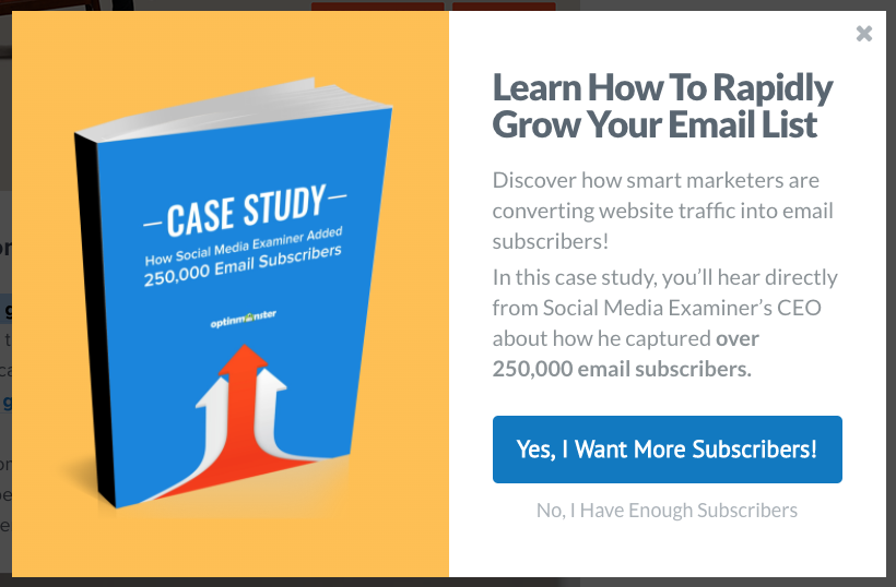
Example from Optinmonster :( Because you already have all the subscribers you’ll ever need.

Even Tushy, a brand I really like does this and says “No thanks, I don’t want a clean butt.” No, Tushy, why?! And in a hard to read color, too.
Why is this a bad idea?
Whether out of trickery or bad taste in humor, it's not a great brand move. It’s not funny; it sounds condescending, passive aggressive, and rude. Your users aren't stupid and they'll be offended if you act like they are. You may end up blasted on Twitter or one of several confirmshaming tumblr accounts.
Confirmshaming also muddies your message and doesn’t achieve goals. It’s a distraction from the value your company offers—that’s what people should signup for. Bullying people into joining your newsletter won't lead to engagement. Micro-conversions on a modal aren't worth tanking NPS scores. It's not worth losing a prospective sale because their first brand interaction was terrible.
What you should do instead:
Keep it simple with a “No thanks"
Use a close icon X that's easy to select on desktop and mobile
Write copy that drives home the value of your content
Better yet, write copy that helps your brand personality shine
Use positive social proof to get subscribers or click-throughs
Make it compelling and based on value of your product or service
Test less intrusive announcement banners or slide-in banners
Tease a content asset they can download
Send them to a relevant, email-gated landing page
Good example:
Gong.io uses social proof to say, “So many leaders from respected companies have signed up for our content. You should, too!”. They also make it visually compelling, friendly, and allow the user to close the modal without guilt.

Gong.io does a good job of giving you reason to signup.
2. Roach motel
You can check in, but you can’t check out.
This one is simple; it's easy and straightforward to signup, but almost impossible to cancel. Roach motels are most common in subscription-based businesses of all kinds:
Subscription boxes
Subscription apps or e-commerce websites
Subscription entertainment, news, or media websites
Monthly clubs, teams, or passes
Saas (software-as-a-service) technology
I found myself stuck in a roach motel when I signed up for Thrive Market. It all started with deal on almond butter and ended with an angry complaint on the BBB website. They're dead to me. 😑
It's understandable that a business will place some friction in the cancellation process. They don't want to lose customers or have a cancellation by mistake. But roach motels go beyond that and range from irritating to nightmare-status. Some hallmarks include:
Long roads and many screens to cancel
Confusing sitemap structure to hide cancel options
Hiding the cancel button
Forcing you to print out, write, and mail cancelation forms
Forcing you to call a person... within specific timeframes... and timezones... and being on hold for hours
Forcing use of an automated system or chat
Absurd cancelation fees
Many "Are you sure?" or benefits-focused screens
Switching the primary "cancel" CTA to "resubscribe" or similar
Using words other than "cancel" like "end renewal"
Audible is a great example. They use a few of these hallmarks during their cancelation process including many screens, most of which are benefit-focused. At one point they hide the button to “continue” going through with cancelation at the bottom of the page where the user can’t see it. Tsk tsk.
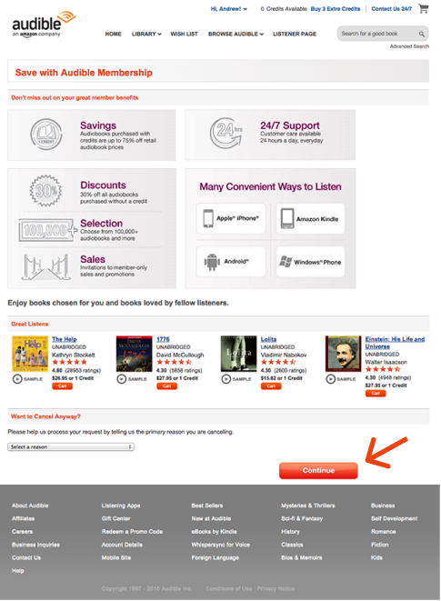
After clicking to cancel, Audible shows a screen of benefits & offers, pushing a “cancel” CTA to the bottom of the page.
Why is this a bad idea?
In the 'least bad' scenario you're losing that customer forever by angering them. They might have been a promoter or a customer you could have won-back in the future. Now they'll be your loudest detractor. They won't think of you as the company that had a no-fuss goodbye. Instead, they'll tell their friends how difficult you were to work with. They'll share it on social media and maybe write a complaint on the BBB website.
It can get much worse. Noom, for example, is a weight loss app that has over 1600+ BBB complaints. Their roach motel was so dirty they recently got slapped with a $100M class action lawsuit citing their convoluted cancel process.
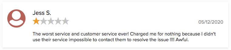
Not great for Noom. 1600+ of these in varying levels of anger.
The class action suit also mentions other dark patterns like the bait-and-switch—Noom’s "live coach" is actually a robot (she handles the cancellations as well. Eek.) And another is forced continuity—after the free trial ended, user credit cards were silently charged without warning or charged for a whole year at-once.

Automated concierge is the only way to cancel Noom, but users claim to get no response
What you should do instead:
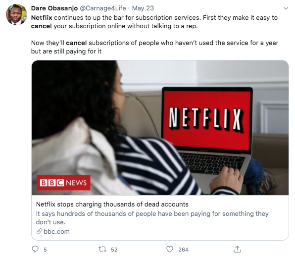
Take a page from Netflix's playbook. This month Netflix announced an unexpected policy. They'll be canceling subscriptions for members who haven't streamed anything for either 12 months since signing up or haven't streamed in the last two years. Is it a trap? Nope, they're letting users opt back in if they want.
Before you say, “Well, I’m not just going to drop people who haven’t worked with me in a while.” hear me out…
Eddy Wu, Director of Product Innovation, wrote:
"You know that sinking feeling when you realize you signed up for something but haven’t used it in ages? At Netflix, the last thing we want is people paying for something they’re not using...
📌 Takeaway 1: Read the room with empathy. Netflix is empathizing with users during a rough time. COVID-19 is throttling the world economy and unemployment is at Depression-era levels. Everyone is evaluating their spending habits. They’re saying, “We see you. We get you.”
If they don’t confirm that they want to keep subscribing, we’ll automatically cancel their subscription... These inactive accounts represent less than half of one percent of our overall member base, only a few hundred thousand, and are already factored into our financial guidance..."
📌 Takeaway 2: Identify your opportunity to make room for cancels. What Netflix did is brilliant. Their cancel subset is tiny and they've already decided to sunset those accounts (likely to improve their data) and have accounted for it in their financials—so the risk is small. Wu continues:
"We’ve always thought it should be easy to sign up and to cancel. So, as always, anyone who cancels their account and then rejoins within 10 months will still have their favorites, profiles, viewing preferences and account details just as they left them. In the meantime, we hope this new approach saves people some hard earned cash."
📌 Takeaway 3: Netflix's approach is refreshing and a ‘humans-first’ policy. It further differentiates them from cable companies (their big competitors), who are notorious for raising rates and being difficult to work with. Further, they’re peppering in language that they’re doing their part to help people save money during the Coronavirus pandemic. They’re establishing goodwill with the public and showing compassion. That's good for the Netflix brand and word-of-mouth organic marketing.
An example of positive word-of-mouth organic marketing for Netflix.
It doesn’t hurt to make a little noise about it. For some subscribers it'll be the nudge they need to finally see this 'Tiger King' they've heard so much about.
Tips from great off-boarding or cancellation experiences:
Map out a straightforward cancellation flow
Follow the cancellation flow and see how easy it is
Offer opportunities to put a "pause" or "hold" on the account
Offer instructions to backup data, download photos, etc.
It's okay to ask for a reason—just don't write anything passive aggressive
Offer a cheaper alternative if you have a tiered system
Offer a solution that suits their specific cancelation reason
Make cancellation available online—not only via mail or phone
If you cannot cancel service online, the phone call should be soon (within 24 hours at the most) and easy
💡Pro-tip for Adobe Suite users: They offer several options when you attempt to cancel on the “Offers” screen in their offboarding. 3 free months, reduced annual plans, etc.
3. Misdirection
Squirrel!
As the foundation for most dark patterns, it's key to understand what this is. Misdirection is focusing the user's attention on one thing to distract from another. Misdirection is also sometimes coupled with obscuring privacy consent options. (Uh oh, she said the c-word).
Websites and apps ask for all kinds of consent to send emails & SMS, collect data, share information, etc. The prompts are endless. Users have become conditioned to select the primary button, uncheck this box, check that box, and accept the "popular" option. With more stringent privacy laws like GDPR and CCPA users can "allow cookies” or turn off most or all data collection. The cookie banner has become the most recent hotbed for misdirection on the web.
Conventions are good. They help establish a common language on the internet and in products. Misdirection is when businesses use these design and UX norms against the user and to achieve their own ends and act unethically.
Misdirection is easy because people don’t read—they scan.
According to NNGroup, 79 percent of web users scan rather than read. Instead of scrutinizing the UI or copy on a screen they will “get the gist” then make a quick selection. Misdirection shirks convention to:
Benefit from ‘snap’ decision-making
Hide information
Be deceptive
Reverse course unexpectedly
Confuse or trap the user
Here are some examples of misdirection in action:
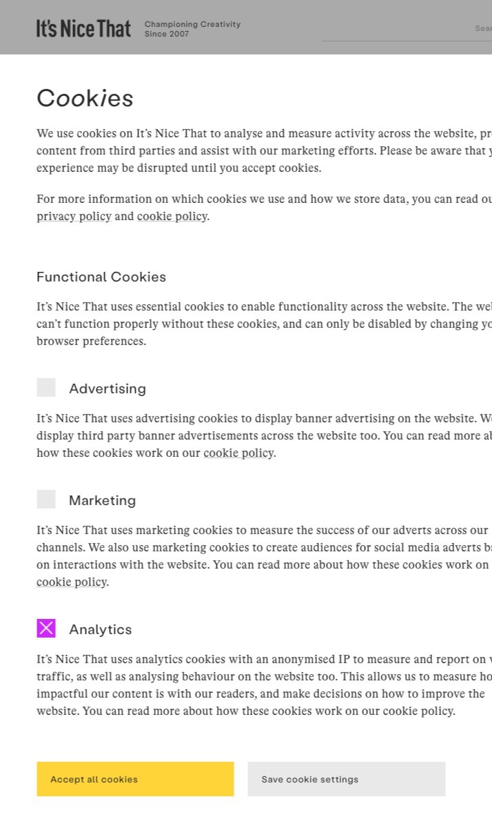
It appears that “Analytics” is the only one checked. Convention says the yellow button would confirm that selection. But, that yellow CTA actually says “Accept all cookies”. Clicking it provides consent for everything.
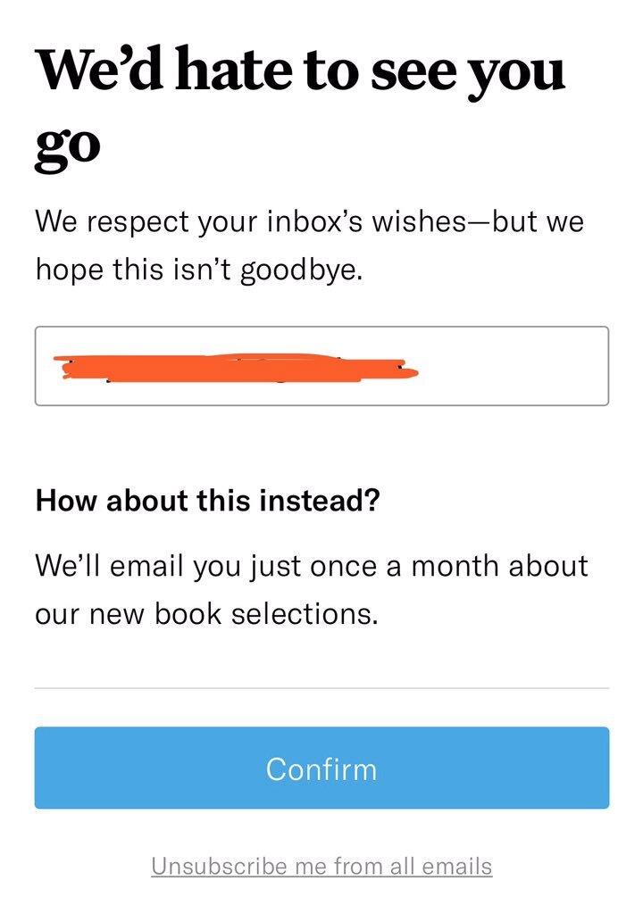
A user opts to unsubscribe from an email. When they get to the page, the primary CTA reverses course. They select “Confirm” to signup for a different cadence of emails rather than unsubscribe.
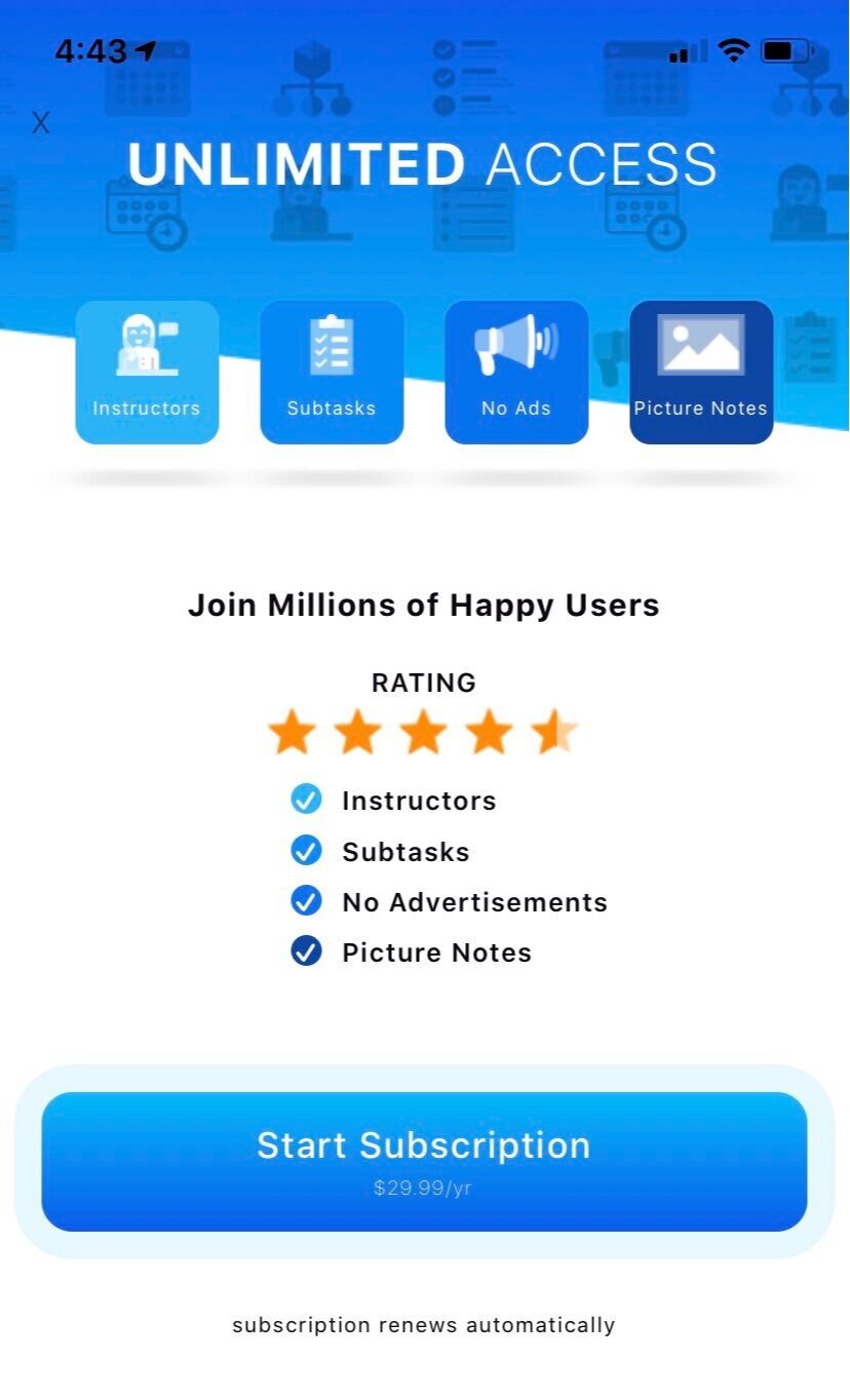
This modal popped up and seems impossible to get out of unless you start a subscription. Can you find the close “X” icon? It’s not in a conventional location.
Why is this a bad idea?
Ever heard of “death by 1000 papercuts”? Misdirection is a tiny betrayal that when compounded over time erodes trust or keeps it from ever growing in the first place. It’s also like getting bad directions from someone—you’re unlikely to trust them anytime soon.
NNGroup has created a pyramid of trust specific to website–user relationships. So many people botch this and use misdirection for quick-gains instead of building trust for long-term success. What’s appropriate to ask for based on the trust you’ve established? This will vary depending on the stage your lead, customer, or audience is in.
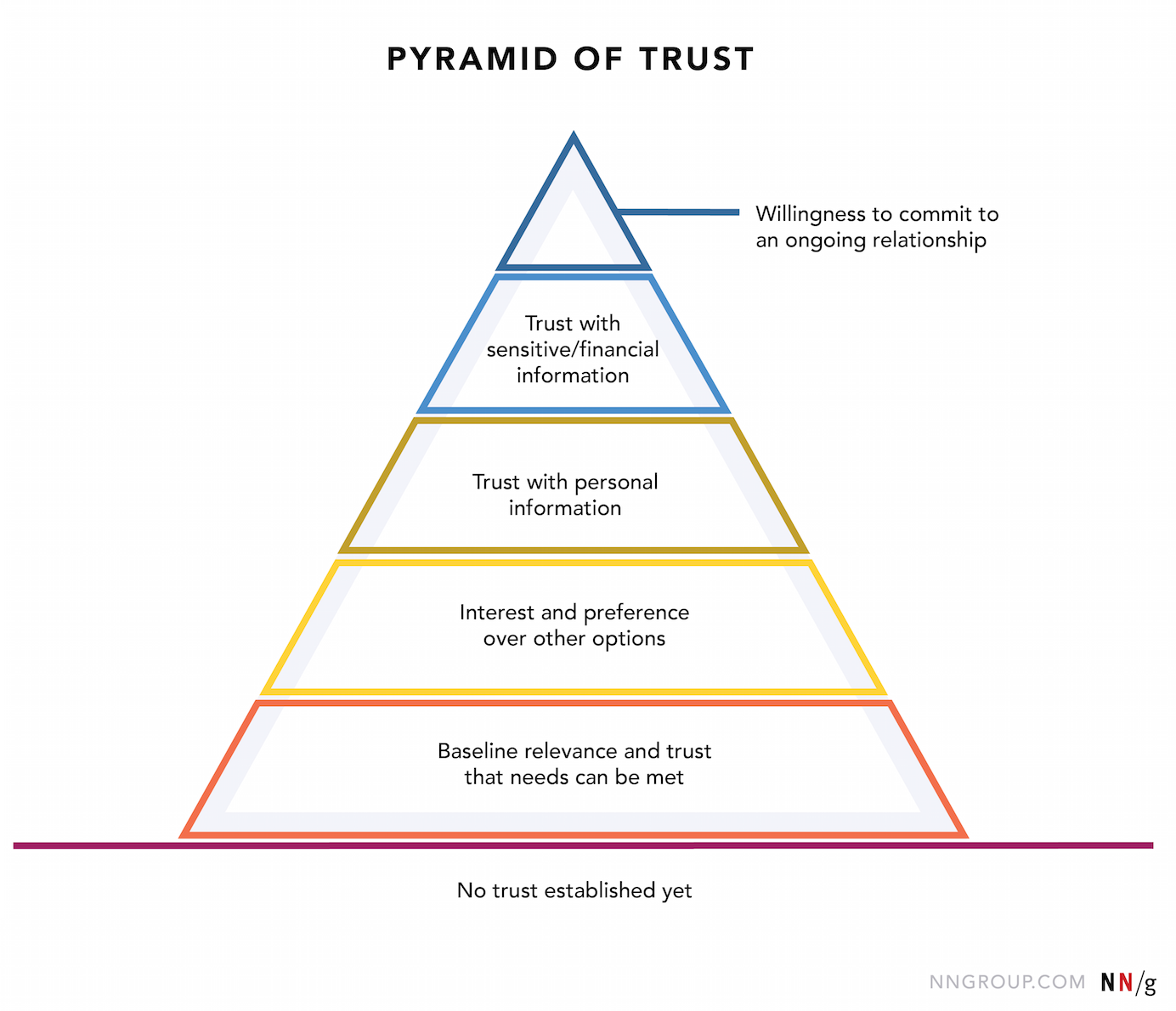
Source: NNGroup.com
When there’s no trust, the relationship you have is transactional. And transactional relationships can only appeal through low prices. Forget about selling on value. Now, you’re stuck competing on what price is lower, not what product or service is better for the customer.
People also trust sites that make them feel in control. Misdirection does the complete opposite. Users will find a competitor that's willing to build trust, empower them, and give them options. That sounds like a more valuable place to be.
Misdirection leads to short-term gains and long-term losses. People exaggerate business data by prioritizing click-through-rates and misdirected signups. In the end this costs companies money to retain unhappy customers, deal with chargebacks, or bring in new customers once old ones have churned.
What to do instead:
Design with honesty. Grow trust and loyalty. Then upsell and request referrals.
Be obsessed about your customers’ needs & wants
Use conventions to build seamless, familiar experiences
Be generous with options and make those options clear
Respect “No”—give users freedom to say “No”, not just “Maybe later”
Do sentiment testing with products like Helio
Add ‘anxiety anchors’ in your user flow—what can you add to build trust?
Use the golden rule. Treat others as you want to be treated.
Good examples:
📌 Clear email unsubscribe links and processes are baseline symbols of transparency for any brand. Make both clear. Alamo does this with a straightforward link to a screen with the one option you wanted. But, they also give a good reason to stay subscribed. I love Alamo and I want those Victory points (🍿 free popcorn!) so I’ll stay subscribed.


Notice Alamo doesn’t use confusing button options or tricky writing. There’s nothing distracting me from the decision or misdirecting me.
📌 The 'Joe Biden for President' campaign provides options and makes them clear in their emails. This tactic improves goodwill with subscribers and helps stave off ‘fundraising fatigue’.
Another benefit is being able to segment their subscribers by who is doing well during COVID-19 vs. not. Then the team can send separate nurtures with messaging that makes sense for those distinct groups.
📌 Some brands do cookie banners right by making them:
Easy to understand and customize
Function as expected
An expression of their brand and values
Iamsterdam.com exemplifies the values of respect and transparency with their cookie banner design. It’s clear when you land on the website that users can approve whatever the defaults are or manage them. When managing settings, every cookie type is explained so the user can make an informed decision.

In conclusion
Do your best to empathize with users, leads, customers, patients, clients—whoever it is you serve on a daily basis. Don’t sacrifice great customer loyalty and brand equity for ‘tricks’ that net you small, short-term gains. Focus on building honest, human-centered experiences and your brand will win the day.
To build great experiences, visit:
humanebydesign.com — for designing ethically humane digital products
ethical.net — ethical tech, software, and resources
lawsofux.com — principles for designs to meet user needs
I’m interested in how you apply ethical approaches to your designs. Reach out and let me know on twitter. 👋

