How UX Research increased Demo Signups
Applying Product Methodology to Optimize a Key User Journey
Using design thinking and a product-driven approach, I conducted the research, synthesis, and design direction for a new Demo page that improved lead conversion for Versapay—where I led as Director of Design.
Through design thinking and UX methodologies, I streamlined the customer journey by removing friction, aligning user expectations with sales, and reducing confusion for existing customers seeking support.
Goal:
Versapay’s Demo page is a critical entry point in the customer lifecycle, yet it wasn’t converting effectively. My research sought to:
Identify friction points preventing users from completing demo signups
Uncover behavioral patterns to align user expectations with product-led demo engagement
Optimize the lead flow to accelerate the path from marketing site to sales conversation
By treating this as a product discovery challenge—rather than just a marketing optimization—I applied UX research methods to deeply understand user motivations and barriers.
My role
Drove project to the finish line
Created research plan and wrote user tests
Built and led CX and UX workshops
Synthesized data to find actionable next steps
Presented direction to C-Suite, RevOps, Product, and Sales and received buy-in on technical updates and sales flow improvements
Collaborated with RevOps, Marketing, and Sales to redesign pages, create product demo explainer video, and follow-up flows
Problems to solve
The existing Demo page failed to drive conversions efficiently due to:
High drop-off rates from a lengthy, overwhelming form
High volume of customer support requests coming through the demo form
Unclear expectations on what users were signing up for
Lack of persuasive UX/UI elements to reinforce trust and urgency
Inefficient handoff between marketing and sales, delaying follow-ups
To solve this, I applied a holistic experience design approach, ensuring the Demo page functioned as a seamless part of the customer journey—rather than a siloed marketing asset.
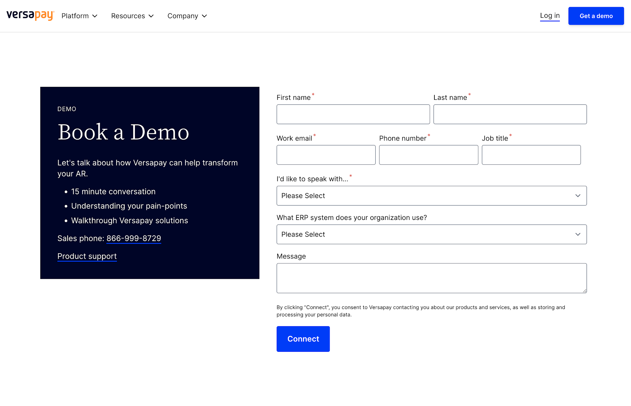
Original page and form design
What people saw after filling out the original form

UX Research
I planned and conducted user research
Timeline: 1 week
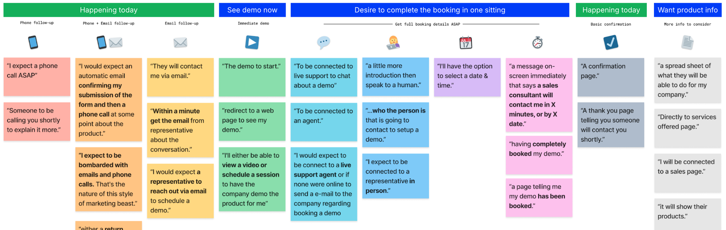
I designed and conducted a UX research study via Helio, engaging over 100 financial decision-makers in the U.S. and Canada. This research mirrored product discovery techniques and included:
Behavioral surveys capturing how users interacted with demo requests.
Expectation mapping to compare perceived vs. actual next steps.
Conversion friction analysis to identify usability roadblocks.
Audience segmentation across key decision-makers (CEOs, CFOs, AR Directors, CIOs, and CTOs).


I analyzed data
Form length and perception of effort
Users found the form too long and intrusive, particularly on mobile
Despite this, they tolerated it—indicating an opportunity to streamline how fields populate rather than remove fields, as the information was considered essential for Sales to route leads
Expectation vs. Reality
Users expected an instant demo or immediate scheduling tool
The term “Book a Demo” was misleading—users assumed they were selecting a time slot, not requesting outreach
Persuasive and trust elements
Recognizable customer logos and testimonials were the most convincing factors
The page lacked a compelling reason to act now, reducing urgency
Follow-up and communication gaps
Uncertainty about what happens post-signup caused hesitation
Users wanted an immediate confirmation and clear next steps (e.g., an email or scheduling link).
I presented UX insights & suggestions
To C-Suite, RevOps, Product, and Sales
When presenting UX research findings, it’s essential to:
Ensure the testing audience accurately represents our users (I created Helio lookalike audiences)
Connect the data to business goals (Goals: increase bookings, decrease support calls via form)
Use engaging visuals and storytelling (Slide 9: Demo follow-up experience rainbow)
Provide concrete next steps to drive impact and decision-making (Slide 14: recommendations)
Recommendations
UI , UX, and CX suggestions
They all work together: A well-designed UI makes interactions easy, strong UX ensures a seamless experience, and great CX builds lasting customer loyalty.
User Interface: Visual and interactive
UI is the look and feel of a digital product—buttons, colors, fonts, and layouts that make it visually appealing and easy to navigate.
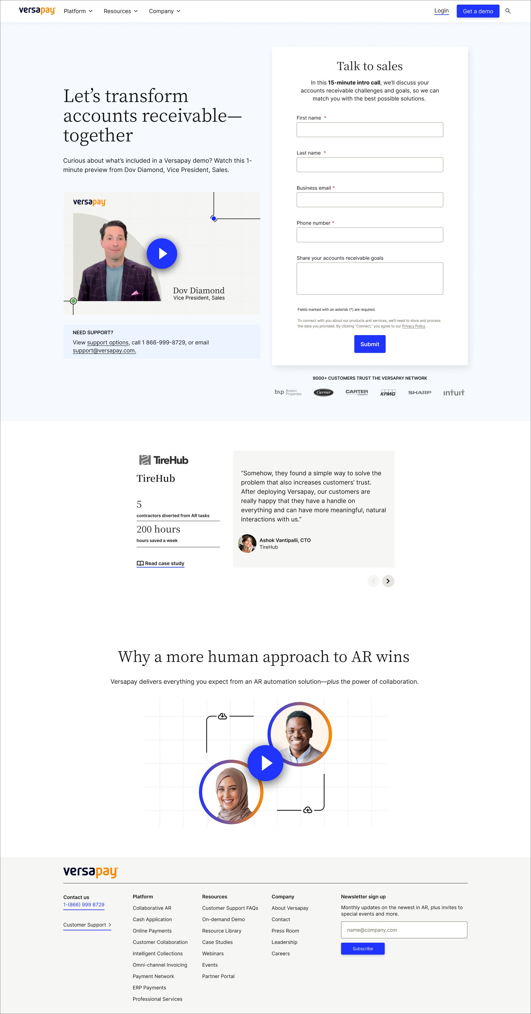
Redesign page for new brand look and usability
Remove unnecessary form fields:
‘Job Title’ can be discovered via Sales Tools
‘ERP’ suggests an ERP-specific demo, confusing leads about its focus
Retitle “Message” field to encourage sharing details and asking questions
Add customer testimonials from industry-leaders to build trust
Enrich post form-fill with resources, product videos, or case studies
User Experience: Ease of use and flows
UX is about how it works—ensuring users can complete tasks smoothly, efficiently, and without frustration.
Clarify follow-up time/method upfront and call within 1 hour
Reinforce “Sales conversation” language to set clear expectations
Use jargon-free language and expand abbreviations
Right-set expectations and increase excitement
Clarify the demo agenda
Tie the demo to specific product benefits
Promote other ways to connect for different buyer personas
Describe live chat as a way to book a day and time instantly
Offer an on-demand demo video on this page
Separate Support and Partners contact from the form to avoid confusion
Customer Experience: Overall perception
CX is the big picture—how a customer feels about a brand across all interactions, from the website and product to customer service and marketing.
Edit ‘storing data’ language to be less anxiety-inducing
Test and audit approaches to stand out from competitors
1-min video: Sales Leader explains demo topics and follow-up
Audit and improve language in demo-specific emails, chat, etc.
Demo page updates
During the discussion of these recommendations, we evaluated feasibility, RevOps' form requirements, and implementation timelines. To balance business needs with user experience, we aligned on key updates, including streamlining the form while preserving essential data fields, clarifying expectations upfront, and enhancing trust signals to drive higher demo signups without disrupting internal processes.
In collaboration with Sales, RevOps, Sales Engineering, and Product Marketing, here’s what we implemented:
“Sales conversation” messaging
1-min video from our VP of Sales to set expectations—highlighting that the demo is a general overview, not personalized
Clarifying the brief call is about their needs and how Versapay can help
Clarifying the form goes to Sales, reducing confusion and support requests
Simplified form:
Separating customer support options from the form
Remove unnecessary form fields
Retitle fields to be clearer and more beneficial to users and sales
Trust indicators:
“9,000+ customers trust the Versapay Network”
Recognizable brand logos from our key industries
Customer testimonials and case studies for added credibility
Adding an explainer video on how Versapay improves accounts receivable collaboration—a compromise, as providing the on-demand demo wasn’t an option based on Customer Acquisition’s pipeline needs
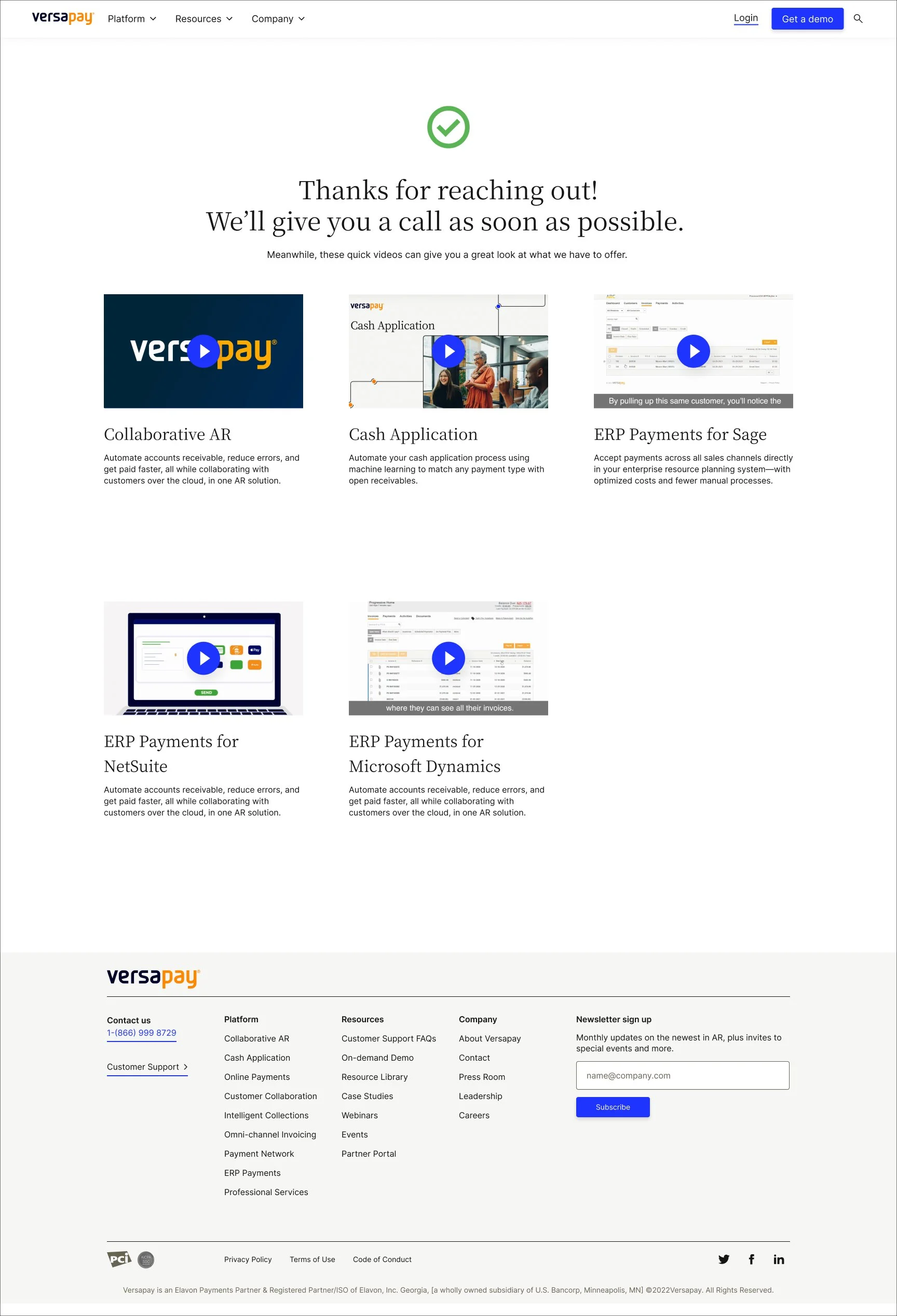
Post-submission updates
In collaboration with Sales Engineering and Product Marketing, we enhanced the post-submission experience by:
Adding videos on top products and ERP integrations to address key customer needs prior to demo
Clarifying that responses would be via phone to set expectations
Reinforcing trust with a green checkmark confirming inquiry receipt
Results
Product thinking applies beyond the product itself—a well-designed marketing touchpoint can improve the overall customer experience just as much as an in-product flow. By approaching the Demo page as part of a continuous user journey, rather than a standalone marketing asset, I created a research-backed solution that:
✅ Increased demo signups
✅ 100% eliminated support call volume via the demo form (as of 1 year live)
✅ Improved lead handoff between marketing and sales