
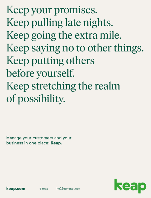
Keap brand launch
Rebranding a $100M, nearly 20-year-old SaaS company
For an established leader in CRM (customer relationship management) and sales & marketing automation software, rebranding isn’t taken lightly. Transforming Infusionsoft into Keap was a nearly two year process that I was fortunate to be part of from end-to-end.

Goals
Appeal to marketing-savvy people
Represent customer outcomes, not ours
Standout from competitors in a saturated market
Be human (not techie)
Evolve the brand as we went
Cohesive brand across web & product
My role
Art direction and leadership over identity, website redesign, rollout, and custom photography. Under Jake Johnson & in collaboration with:
Partner Luke Hayman at Pentagram (Identity, Naming)
Gold Front (Video)
La Tigre (Illustration)
Letters from Sweden (Font)
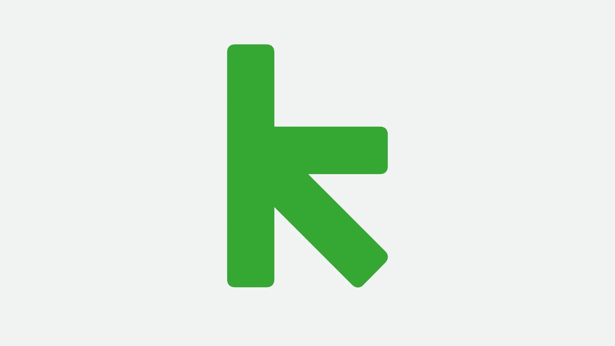
Keap’s logo is simple and a modified version of what became one of our main brand fonts (Sul Sans). It has slightly rounded corners and feels approachable.
Keap logo

Pentagram designed a handful of logo options based on the research they had done, as well as audits, color inspiration, and additional guidance provided by me and my leader.
I got buy-in from Executives and co-founders on the strongest direction.
The strongest direction was one that would be balanced, and not too trendy. We didn’t want to rebrand again in 5 or 10 years. We also wanted a form that was a bit… “off”—in a good way. While still readable, our chosen direction has a unique form in the ‘k’.
It’s odd enough to be memorable, but easy enough to draw from memory.
Original name & logo
Dated. Enterprise-y. Forgettable. Marketing research proved our aided awareness was low—which meant prospects weren’t remembering “Infusionsoft” even after seeing a demo of the product. Our brand wasn't resonating with the customers we wanted, and was perceived as “for larger businesses”.
Keap with an ‘a’ instead of second ‘e’ is a play on ‘keep.’
The name started as a nod to what a CRM and Sales & Marketing Automation software does. It keeps your customers in one place and moves them through your sales processes. As we reflected on it, there’s also something deeper. Every entrepreneur has a “keep going” moment (or a hundred of them), where they have to choose to push through the doubts and chaos. It’s what makes small business owners who they are. So at Keap we encourage everyone to “keep going, keep serving, and keep growing.”
The Keap arrow
Embedded in the name’s natural form is an arrow—the greatest of design’s happy accidents. At a high-level arrows communicate direction, growth, movement, and flow. The team relished that our arrow even ‘zigs’ when it’s expected to ‘zag’, as growth-minded business owners often do.
Arrows are essential to Keap’s brand system—and to automation
Pentagram may not have realized exactly how apt the arrow was. Arrows are a common UI element in automation builders. Keap’s automation builders connect every key trigger and action with an arrow.
Color
Color is subjective and, naturally, it was discussed at length. One option that hit the cutting room floor was a vibrant crimson logo. We presented it along with other options to the Executives and a couple responded strongly:
"Red stands for losses."
Red is the worst symbol for businesses for that reason—lost revenue, time, and unpaid invoices. Despite that, we explained why it was a great option and how we could own a color no one else did in our space. But we knew they had a good a point regarding the association. Letting go was the right call.

Taking other bigger wins into account (namely, the logo itself), we were happy with a vibrant green logo, supported by high-contrast blues, greens, and subtle background washes. The logo:
Still stood out in a sea of blue or black competitor logos
Represented growth
Would be well-received (green had history at the company)
I partnered with Product to work brand elements into the app and to inform the new icon system.
We also collaborated on additional colors in the palette specifically for in-app functions like reporting.
Icon system by Product Designer Sean Rice
Animations by Sr. Designer Brandon Clute and Product Designer Nick Hopkins

Typography
I oversaw the creation of a typographic hierarchy that would:
Resolve current web font pains (lessons learned from previous fonts)
Work for the website and Keap’s app editions
Be accessible and work for the user in various contexts
Pentagram called up font foundry Letters from Sweden. They created a more rounded version of their typeface Ivar just for us, called Ivar Soft. The resulting serif is versatile at scale and friendly. It also gives a nod to Times New Roman—a font that our ‘Main Street, U.S.A.’ customers are all too familiar with.

Sul Sans is the supporting sans serif font in our system. It makes dense body copy and the Keap interface readable. We learned from our previous font that we needed something narrower and less ‘techie’ in appearance. We also gained Sul Mono, a monospace font, into our system. It’s especially helpful for technical data, numbers, and captions.

Photography
Our new style features real people in the environments where they actually work.
It feels photojournalistic and stood out from competitors with crisp, directional lighting and harsh shadows that’s uncommon for brands like ours. I was the on-site Creative Director over all photoshoots, vetted & styled the spaces, and worked with makeup & wardobe.


I led acclaimed photographer Steve Craft on these customer shoots then honed our in-house resources in the following months to level-up and create more customer shoots replicating the style to keep our costs and spend low. Additionally, I:
Vetted customers and spaces
Created the shot lists
Sourced props
Wrangled extras
Worked with product marketing for device shots
Provided video interview and b-roll direction
Illustrations
The CMO, fellow Directors, and I debated whether we needed illustrations in our system. We hesitated because of we’d seen illustrations misused in the past—as decoration without intention or context, mostly.
Avoiding illustrations may have ‘solved’ those problems but we would have neglected an opportunity. Illustrations make work more fun for our customers. They also drive home concepts when paired with short supporting copy.
Illustrations needed to be more than decorative, I ensured they had a function in the business by prioritizing them for our brand positioning & benefits messaging
Spur action on Keap’s empty product screens
Make features more scannable on Keap.com
Personify customers or contacts when we couldn’t use photos
Add playfulness to what was shaping up as a more ‘serious’ look

We developed a straightforward and simple illustration style in partnership with Pentagram and the Milan-based studio, LaTigre. We provided the 20 most common concepts, features, or customer-focused benefits that would be used in our launch’s new messaging. This provided a framework for La Tigre to create a cohesive system with direct application in product and in our marketing. Each illustration had a defined, high-level purpose and messaging to pair with it.
I led La Tigre to build a style & system my team could replicate and expand upon
LaTigre created standards and brushes for my team to use to easily expand the system. Here’s a sampling of some of the illustrations created by my in-house team for various screens in-app. Our illustration gallery continues to expand today by following the system.

Relaunching Keap.com in 9 weeks
Shortly past midnight on January 29th, 2019, our team ‘turned the switch’ and pushed our completely rebuilt site live. Our Keap.com launch team won Keap’s Quarterly collaboration award for the work. There’s so much to say about this process, that I’ll share my take in another place. For now, here’s an excerpt from our award nomination to give you a quick rundown of the rebuild:
"Keap.com was fundamentally rearchitected, rewritten, redesigned, and released in 9 weeks. The timeline included new prospect research and usability testing of three full site prototypes, which helped define the sitemap and identify user journeys to optimize.
Back-to-back sprints followed, in which UX Research, Design, Development, SEO, Product Marketing, Copy, and Marketing Ops acted as one team. Everyone collectively checked ego and prioritized swiftly from Kickoff to QA—resulting in the smoothest major site launch in two years and a beautiful, highly usable website to boot.
Overall, site traffic is keeping pace, and we're seeing an increase in conversion events across organic. On top of that, we closed the project with cross-team alignment around upcoming message testing, usability studies, and an alternative homepage design to A/B test, ensuring our teams continue to work alongside each other."
– Laura Collins, Director of PR & Social at Keap

Early-on in the redesign of Keap.com, I ran a 5 day sprint in Figma for all designers to collaboratively redesign and expand our UI into components.
Getting everything done in 9 weeks meant we needed to rethink typical workflows. Making this an ‘all hands on deck’ initiative invigorated the design team and led to better output as we shared ideas. In those 5 days I:
Led my Design Team to explore divergent styles
Guided team alignment on components our developers would build
Organized the rebuild with my Creative Producer (PM)
Supported my team by designing some pages, flows, and UI
Worked with my Sr. UX Researcher & Demand Gen on sitemap structure
Met with Org leaders on expectations for launch day assets
…plus normal day-to-day work, because Marketing never stops.

Aligning teams across Keap
Over the final 2 months before launch, it was an “all hands on deck” effort to update assets across online properties and product. My leader and I co-ran weekly Brand Review sessions that leaders from all departments attended to get feedback and guidance.
Like design critique, but for the whole company.
This wasn’t only about assets looking nice; it was about creating a space to:
Build trust in the new brand
Answer questions and equip leaders to get buy-in from their teams
Rebuild bridges between fractured teams
Hold each other accountable to fulfilling company and customer needs
Brand asset management
I partnered with Product Design leaders to onboard Frontify as a vendor and build our first real brand repository.
Previously, we had no ‘single source of truth’ for brand assets. I led the creation and rollout of our Frontify platform to employees and our partner network. Today, I am working on more expansions to the system and an overhaul to our media libraries and messaging.

Transforming the Keap office
Pentagram designed the wall vinyls and provided longterm plans for our space to be reimagined. I advised Facilities as paint colors were selected and the office remodel was underway. I worked with the People team and Internal comms on creating the Launch Day assets and announcements to generate tons of internal and external buzz.
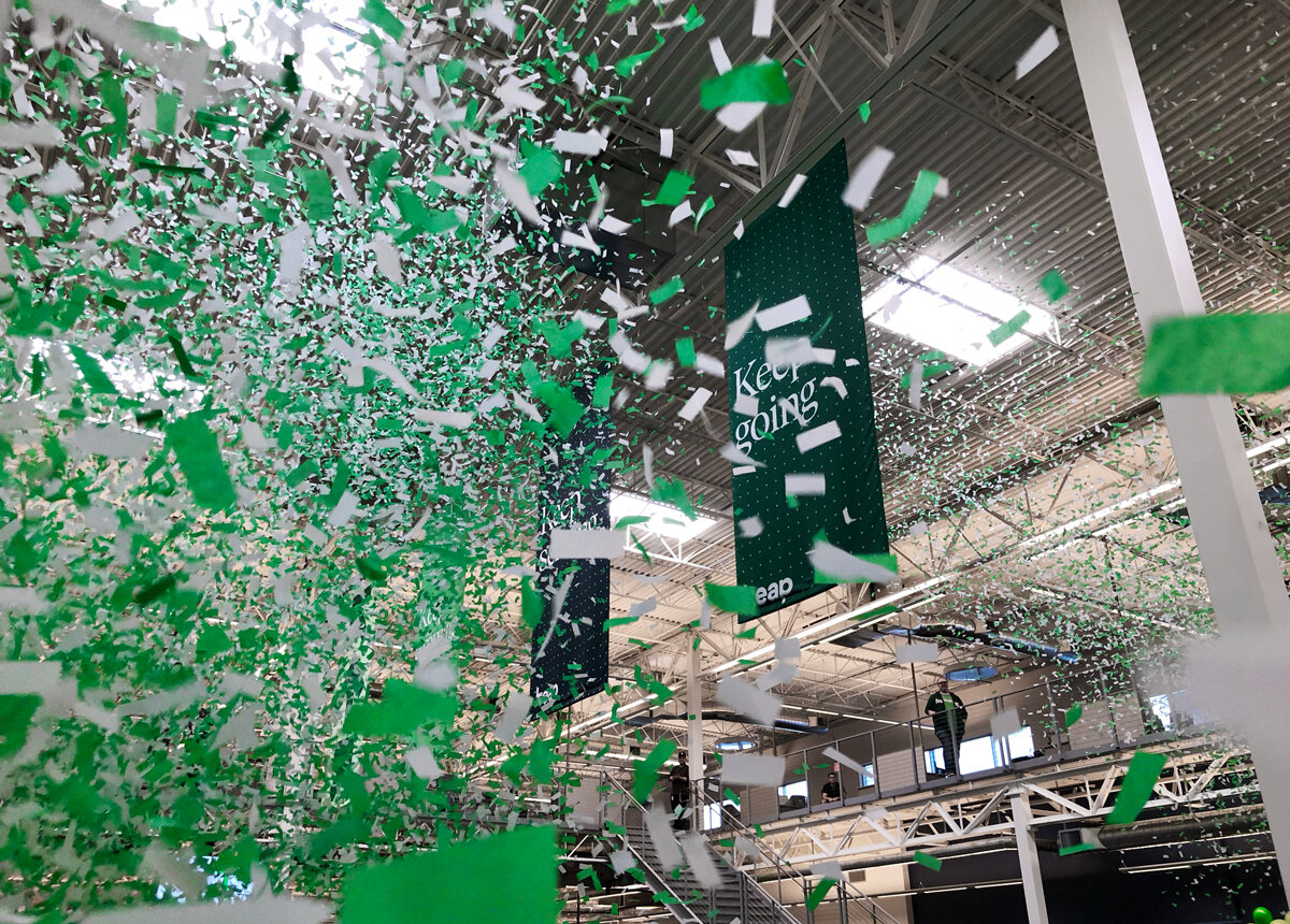


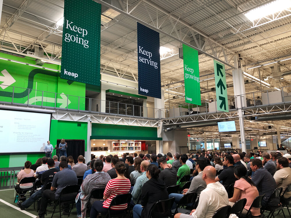
450+ people become Keapers
January 29, 2019
Every Keaper received a special gift box to celebrate our new identity. It wasn’t about self-indulgence (okay, perhaps). Employees needed to feel the distinct shift and move ahead together into our new identity. We used to be “Infusionites”—now we’re Keapers.


We created swag people would love to wear and use every day.


Everyone received new badges—the truest symbol of an office overhaul.

Launch campaign
3,113,300+ views on YouTube
As of 12/2020
Gold Front created our first-ever campaign commercial alongside my leader, Jake Johnson. It dramatizes an obstacle small business owners are all too familiar with—the doubters who said, “You’ll never make it.”

Results
Steady site conversions pace at or above pre-rebrand for 4 months
Our goal was to stay at CVR pace post-launch.
Very positive customer & partner sentiment
“And as for the new brand rollout... bravo, sir. Very smooth, very well done. Please spread the good word around if needed, the marketing team did a great job!” – From a customer about Keap
Cancellations/Churn dropped for 4 months
Showing increased confidence in our customer base.
Improved lead quality to sales
This was an immediate sign we hit the right look, feel, and messaging as well as our overall brand positioning.
Expected organic dip in first 3 months
We saw an expected dip in organic branded search, prospects, opps for the first three months, and worked to improve over time with a pre-defined SEO strategy. With our unified product family launch coming February 2021, we’re on track to improve beyond pre-rebrand organic branded search numbers. We recently saw close to 50K branded search impressions from the Big Grit brand campaign, which I fully ran.
Two years later
Direct sale & buy online MRR increased 36% year over year since the rebrand, new positioning, messaging, and experiences.
Keap also received a large infusion of investment from the Board after achieving profitability goals post-rebrand, proving increased confidence from customers, partners, and the Board.
